
So often, a major life change is the trigger for a change in our homes. Last week’s Redesign Reveal was a job change and some are more obvious like a new baby or growing kids (and toys). This one all started when my sweet friend’s oldest son graduated high school. Not only was their family dynamic changing as he was leaving but they found their home worked differently too. And she found a love for painting. This, my friends, was the perfect storm to create an amazing guest room with one of my most favorite people.
Take a look at a few before and afters (also please note, this before were during the “moving out process” as they were shifting rooms in the house)


This is possibly the most eclectic room in my portfolio and I love it so very much. Here’s what we can learn from the space…
1. Start with Art: This piece. Can you even believe it? My client found a love for painting during this season of life and created this piece specifically for the space… then we created the room specifically for the art. Everything revolved around the art… the colors, the textures, the lighting. It’s amazing how each element brought more of the life out of the painting. Which goes hand in hand with the next point….

2. Trust the Paint Selection Process: I love my friend dearly but her Pinterest reading was all over the place. There was light and dark, sleek and rustic, glam and muted… anything would have worked but when selecting colors, we went back to the art. I mocked up 3 different options of the art in a room and let her pick. She immediately said NAVY. It made the art pop and gave her all the jewel tone feels she love. So we still tested 3 different navy paints: a true navy, a gray toned navy and one that really pulled green. Something magic happened. When she put the greener tone against the painting, it came to life. It pulled a whole new range of color from the painting. I am actually pretty good at seeing a wide range of color but I didn’t even notice there was a deep, emerald green in the painting until that moment. We were both sold and it’s even more gorgeous saturating the entire wall. Part of the goal here was to lighten and brighten, so we went with our trusty Alabaster in the rest of the room so the darker tone didn’t overwhelm the space.

Design Tip: I love a dark, saturated room and this one would have been gorgeous on all the walls…even the ceiling. If you like that feel, do it! Here it just worked better for my client to keep the other walls light.
3. Use what you have: We had two beds to choose from: rustic wood or modern galvanized silver. This was one I wrestled with for some time. Neither worked with the painting and would just take away from it but a new bed was just too much to ask for. So I made a crazy suggestion and she made it happen. She painted the metal frame flat black. This neutralized it against the darker wall and gave it more if an eclectic vintage feel and all it cost was a few cans of spray paint.


She also inherited the furniture pieces and they were so fun to incorporate. They added a bit of warmth the space needed and they’re even more special because of where they came from. You don’t have to get all new stuff to make a room into all it can be. That is the beauty of redesign.

4. Balance is key:I already said it, but it’s worth saying again that is is probably the most eclectic room I’ve done. If you look at the elements, we have modern art, antique furniture, fur, leopard print, emerald green, white, black, gold… I put it all together and I’m a little overwhelmed by that list! But I’m in love with the room. It has an amazing feel to it… it’s fun yet peaceful. It’s all the good things in one space and that is only possible because of balance. Let’s dig into that further…
- Mixed Metals: There is gorgeous gold in the painting so we highlighted that with the lighting, but kept the bed and curtain rods black.
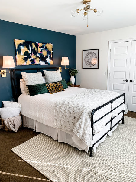
- Light and Dark: We already discussed the paint colors but keeping the darker tone on one wall and even the creamy curtains on the other kept it from being just “too much:” a darker curtain would have given it that “2001 Trading Spaces” feel and that’s not what we were going for. I added the mirror to this wall so you catch a glimpse of the dark and it pulls you in but doesn’t overtake the space.

- Feminine+ Masculine balance : My sweet friend lives in a house full of boys who love boy stuff. There are literal animals on the wall just one room over so she really wanted this to be her “girly” space. But since it’s also the guest room (and the room her college son will come home to) it needed the best of both worlds. The fur throw at the end of the bed and few little touches (i.e. a tray that looks like antlers… but in gold) kept it from being too girly, but the light airy feel, the jewel tones and pop of leopard… not to mention the amazing art, made it still have that feminine charm. Balance. That is the key in all things!

5. Take a little risk: Here’s a little insight into the process. My clients make the big decisions. I’m not about to paint a wall and surprise you later. They know the big stuff… but the little details are all mine. I lock myself in the space (not really but I politely tell my clients to “KEEP OUT!” until I'm finished) and work my magic. Sometimes it just all comes together and sometimes I try out 97 different pillow combinations (I’m pretty sure Home Goods is going to ban be soon for all my pillow returns) This time, I landed on three possible choices that would seriously set the tone of the room. I finished it all then asked my client to pick, “Wild, neutral or simple?” Thankfully she picked wild because this emerald and leopard combination is incredible. If I made that decision, I 1000% would have picked “wild” in this space, but I asked because it wanted to know she was that confident in to too. (I must add that she is the most decisive, action taking client I have EVER worked with. We talked about this space for months but when we officially got started, it was the fastest one ever. I knew she would be confident in her decision and never look back)

(I let her see all the choices and we both agreed WILD was the correct choice. I didn’t take any pictures of the other options and promptly returned the others because this is the right choice and I want no second guessing that)
Because this client also happens to be my friend, I know this room is much more than a guest room. It’s a mark of a major transition in their life. It all goes back to what I always say. This is so much more than making pretty spaces. Our homes are meant to serve our families. They’re a safe haven during all the times… good and bad. They’re the backdrop for so much of life. Each space serves as a marker on our timeline… whether it’s painting the nursery, transitioning the grown kid out of the nest and all the little moments in between. The design is important, but only because it gets to be a part of the bigger business of our homes… our lives. I am so very honored to help one of my most favorite families create a space to help usher in a new season.